Climate Risk Dashboard v2: Why I Rebuilt It
 Jimmy Matewere
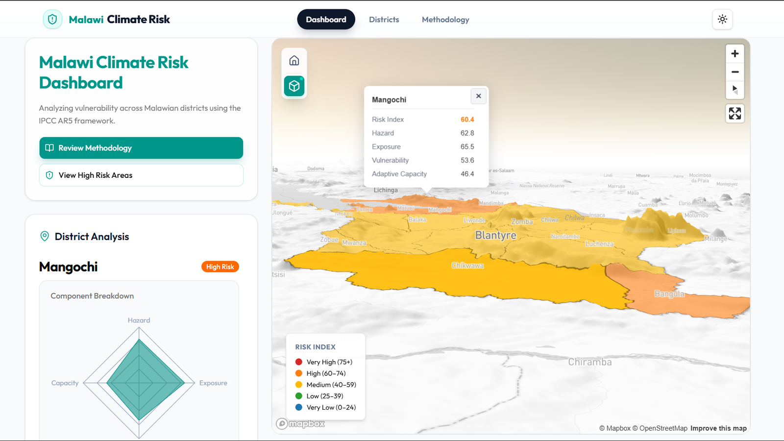
I knew most people access LinkedIn on mobile. I just hadn't built towards it.
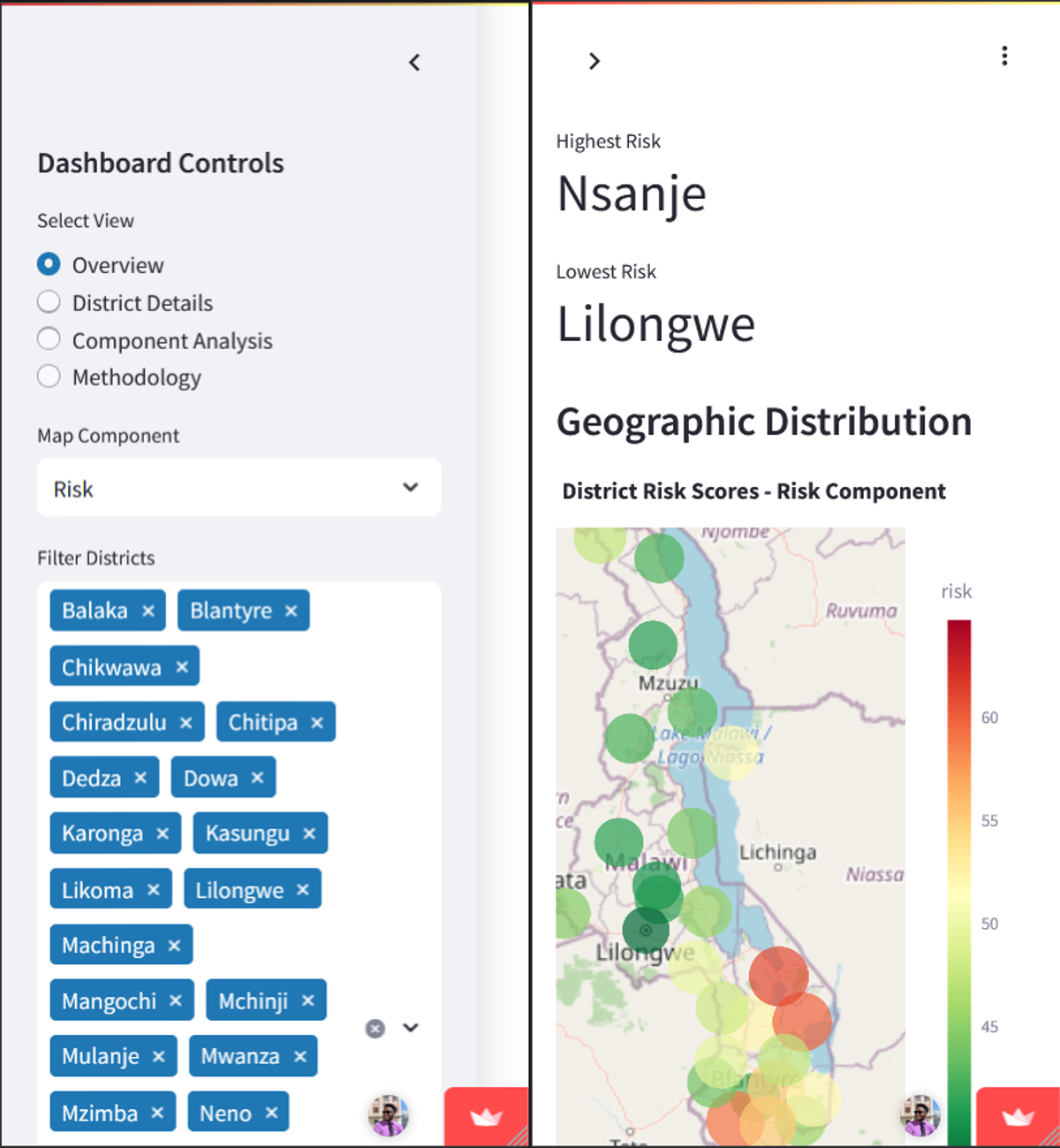
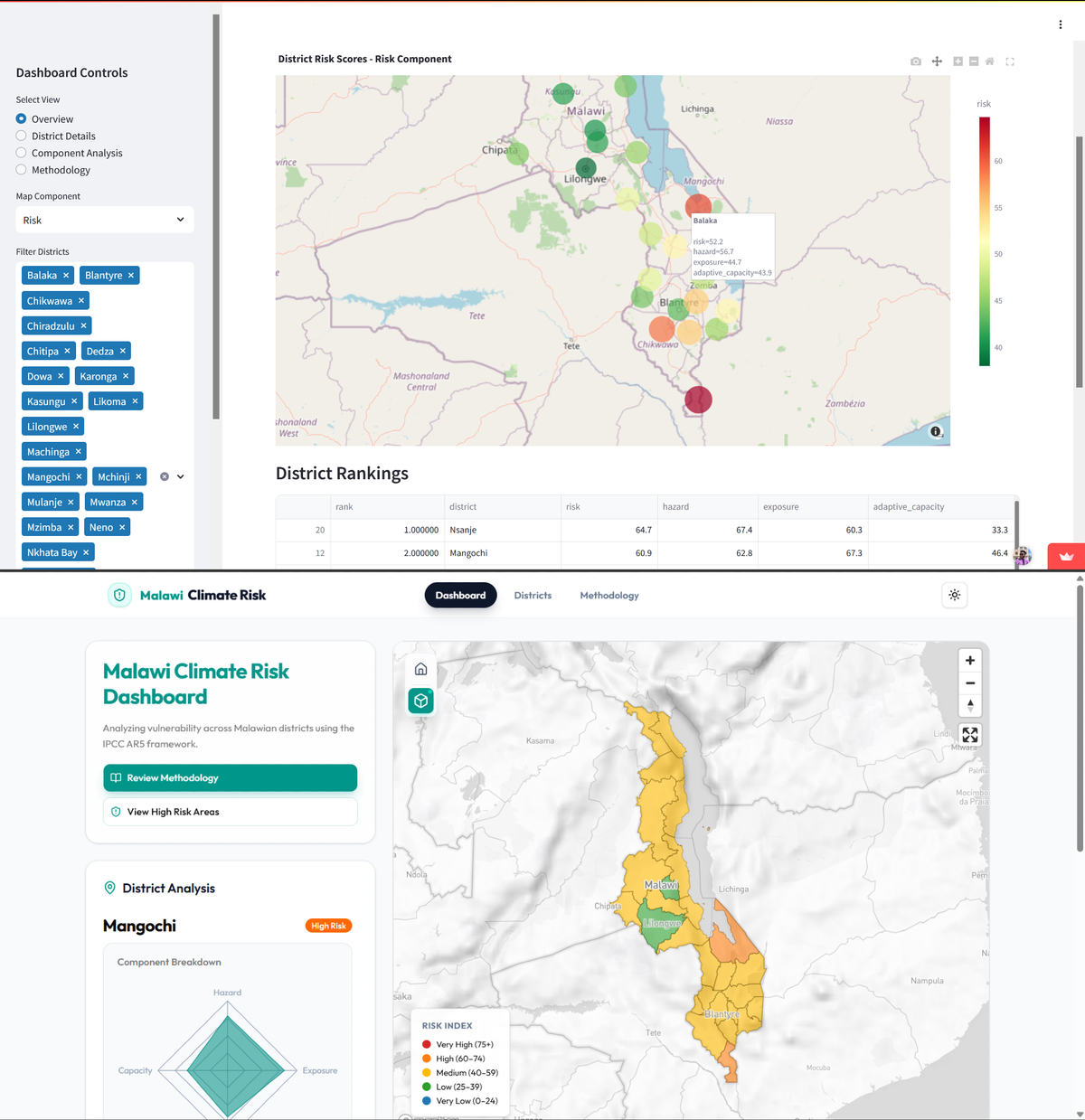
That gap between knowing something and designing for it only became real when I asked people for feedback on my portfolio and they sent screenshots from their phones. The Streamlit dashboard had a sidebar taking up a third of the screen, filter controls, view selectors, district lists, all of it demanding attention before any data was visible. On a laptop it was fine. On a phone it was the entire interface. The map was buried underneath it.
The cold start problem was separate but pointed at the same thing. Streamlit apps on the free tier spin down after inactivity and take a few minutes to wake up. UptimeRobot helped, but anyone landing from my portfolio for the first time had a real chance of waiting long enough to leave. You don't get that impression back.
There was also the map. I called it a choropleth in the original post. It was point markers, colored circles at district centroids. It communicated the right scores but the wrong geometry. District-level climate risk is an area-wide condition, and representing it as dots invites misreading. I'd accepted that limitation because Streamlit's Plotly integration made genuine polygon rendering unnecessarily complicated, and at the time I just wanted the thing deployed.
None of these alone would have triggered a rebuild. Together they described a tool that worked on my machine and not much else.
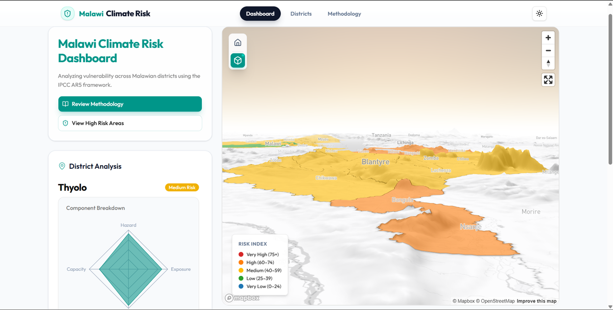
Moving to Next.js and Mapbox GL JS resolved all three structurally. I controlled the layout, so the mobile problem became a design problem rather than a framework constraint. Vercel deployments don't have cold starts. Mapbox made the actual choropleth straightforward, filled district polygons, click to expand, map and district panel visible simultaneously rather than split across separate views.
The 3D terrain wasn't in the original plan. A few months before this I'd built an elevation map of Malawi in QGIS and Blender, terrain-shaded, showing the Shire Valley dropping from the escarpment down to the southern lowlands. When I found Mapbox's native DEM terrain extrusion I turned it on, looked at what it produced, and left it on. The Shire Valley sits visibly lower than the surrounding escarpment in the dashboard map. Nsanje and Mangochi, the two highest-risk districts, are at the bottom of it. Elevation accounts for a significant part of why they score the way they do: flood exposure, drainage patterns, heat accumulation in low-lying areas.
The methodology changed too, and that part was less clean. I adjusted the sub-indicator weights, increased local institutional capacity from 15% to 25% within the vulnerability component, offset by reducing the poverty rate weight. I also introduced a 0.05 floor so that a district with very high adaptive capacity doesn't mathematically zero out its overall risk score. Before committing either change I ran a sensitivity analysis comparing district rankings under the old and new weights. Part of me wanted the rankings to shift significantly, which would have meant the weights were doing more work than I thought. They didn't. The top five most vulnerable districts stayed exactly where they were.
That stability was both relieving and the right outcome. Nsanje at the top makes sense to anyone who knows the Lower Shire Valley. Lilongwe and Blantyre ranking near the bottom surprises people until you understand what the framework is actually measuring: systemic fragility to climate shocks, not absolute damage potential. High-capacity cities with dense services and institutional infrastructure are genuinely more resilient to the same hazard than a rural district with 80% poverty rates, even if the economic exposure runs the other direction. The numbers being consistent with what you can see and know is the point. Let the data represent itself rather than chasing a result that confirms a prior.
The v1 Streamlit dashboard is still live with a banner pointing here:
Continue the Conversation
I welcome peer perspectives and questions regarding any of the topics discussed.